📱 Benchmarking the Pricing Strategy of 100+ Subscription Based Mobile Apps
Overlooked #39
Hi, it’s Alexandre from Idinvest. Overlooked is a weekly newsletter about underrated trends in the European tech industry. Today, I’m digging into the pricing strategies used by 100+ subscription based mobile apps and I’m introducing AppFuel to the world.
Three weeks ago, I started to dig into the pricing strategy of subscription-based mobile apps. I wanted to find both quantitative and qualitative insights. I ended up compiling the pricing of +100 mobile apps and digging into half of them to understand their strategy to convert free users into paying subscribers. In this paper, I’m sharing my first findings.
I’m excited about this issue of the newsletter for so many reasons:
I discovered many mobile new apps thanks to your contributions. It’s the first time that I’m able to onboard so many people to participate in an issue of the newsletter. Thanks you! 🙏
Clément Vouillon helped me cover the topic. He gave me insightful feedback. He also published five complementary short videos on subscription based mobile app pricing strategies. You can find them on Twitter as well as in this paper.
But most importantly, this paper is part of a bigger side project that I’m working on with my friends Maxime and Thibault.
We are building AppFuel: the inspiration station for app builders. Our very first product is a library of mobile apps screens and a set of best practices to help product designers and indie makers launch their projects faster.
For instance, if you are working on the onboarding of your app, you will be able to browse the onboarding flow of 50+ top-notch mobile apps and break it down into specific pieces (customization, sign in with Apple, monetization, account creation, notifications activation etc.).
We are looking for beta testers that we will onboard manually on the first version product. If you are interested in becoming a beta tester or you want to access the product when it’s live, you can register on the landing page.

In this paper, I will answer the following questions:
What are the learnings from the quantitative analysis of the pricing from the 100 mobile apps benchmarked?
What pricing point should you pick?
When should you push your subscription in the customer journey?
What are the key ingredients in the activation flow?
How to present your pricing?
Part I – Pricing Benchmark Overview
I looked at the pricing of 100 consumer based mobile apps across heterogeneous categories like meditation, creativity, entertainment, education, fitness etc. For this initial study, I focused only on prices in the US AppStore. You can access all the data here.

The key insights can be summarized in the following graph:
Most apps are offering both a monthly (81%) and an annual (90%) subscription with a 49% average discount to push users to favour the annual over the monthly plan,
I discovered that some mobile apps are also offering lifetime plans which are priced to be equal on average to 3.7 years of annual plans,
There is a high dispersion of prices independently from the time period you are looking at. For instance, annual plan prices range from $11.99 to $199.99 with an average at $63.

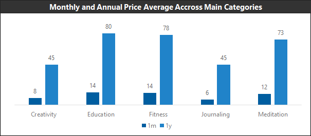
When you break down pricing into categories, you have a higher pricing homogeneity and you discover different pricing dynamics - some categories being overpriced due to lower competition or higher barriers to entry.

Part II – Picking a Pricing Point
In this video, Clément talks about the main differences between setting your price for a SaaS product and for a consumer subscription product
If you take a step back, your price is dependent on the value that you are providing to your customer. A good proxy for the value offered to the customer is the usage frequency. Anything else being equal, users will be more willing to pay a higher price for an app with a daily usage compared with an app with a weekly or monthly usage. In the below graph, GP Bullhound tried to draw a correlation between usage frequency and price. Overall, it’s working but you have outliers that are either charging a high price despite having a weekly usage (e.g. Storytel) or charging a low price despite being used on a daily basis (e.g. app to read the Koran or Natural Cycles).

I believe that there is also a psychological pricing threshold in consumer subscription above which consumers will be less likely to pay for a product. This threshold is between $120 and $140 per year and corresponds to the Spotify and Netflix subscriptions. It’s hard to provide more value to users than these two apps which are used almost every day and have a relatively low price point relative to this value.
If you want to go beyond this psychological threshold, Clément gives good insights on how you can up-sell your existing customer base through (i) a prosumer plan in which companies will pay for the app or (ii) bundles
Part III – When Should you Push your Subscription in the Customer Journey?
You can divide market practices into three main categories:
The super-early activation: the subscription will be the first thing pushed to the user just after the download - sometimes with cunning practices to make you click by error or to make you believe that is the only way to use the app.

The early activation: the subscription will be pushed to the user during the onboarding after clarifying the value proposition and / or having the user put personal data into the application.

The late activation: the subscription will not be pushed before the user has played with the core sections of the application. Sometimes, large sections of the app are locked to the users. Sometimes, the app pushes subscriptions only when the user is really hooked. This is the model mainly used by freemium apps in which you will be able to access 80% of the app for free and you pay only for a set of features that will make your experience even more compelling.

Part IV – What are the Key Ingredients in the Activation Flow?
I define the activation flow as the sequence in which you will pitch the application to the users and then display a pricing page to subscribe. In most subscription-based mobile applications, the activation flow is included in the onboarding process. If the user does not subscribe during this onboarding process, the activation flow will reappear later on when he navigates through the core pages of the app.
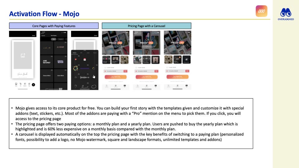
I looked more closely at three great activation flows (Duolingo, Mojo and Reflectly) to give you a better understanding of the key ingredients that could be included.


Below are the main potential components that you will find in an activation flow:
A list of key benefits (both quantitative and qualitative),
An highlight of the goal your user wants to reach,
A side by side comparison between the free and paying plans,
Reviews from other successful users,
Used the “feature by Apple” as a marketing argument.
Part V – How to Present your Pricing?
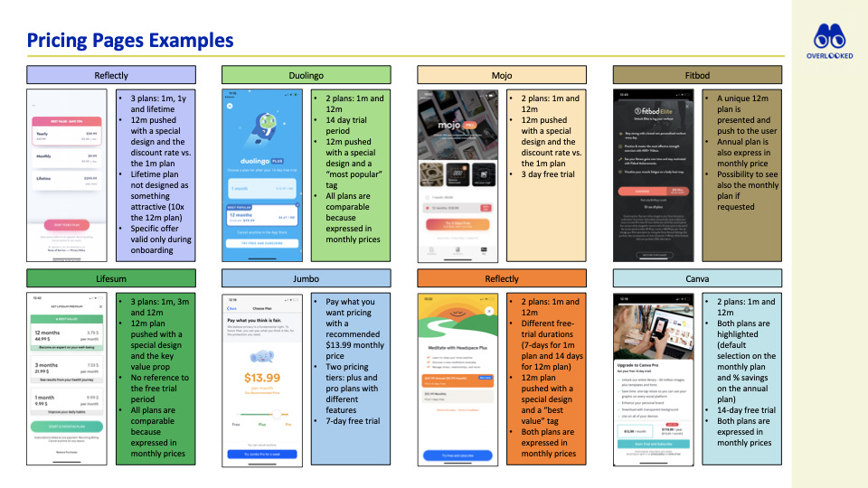
At the end of your activation flow, you will present your pricing page to the end users. There are many variations between applications but the most common way to present your pricing is to push two options to the user: a monthly plan and annual plan. You will push your user to pick the annual plan with a specific design and by giving a discount of 35% to 50% on the annual subscription compared to the monthly subscription. You will also give a free trial to your user that is anywhere between 3 days and 1 month.

Below are the main components that you should think about while designing your pricing page:
Several pricing options (between 1 and 3 options),
One option pushed vs. the others highlighted with a special design, a % discount vs. other offers etc.
Duration of the free trial (from 3 days to 1 month),
Make options comparable between each other (e.g. monthly price for each subscription),
Convert the pricing into a daily number ($29.99 per year is less than $0.1 per day),
Special offers which are only valid during sign up or at certain moments in the application.
In this video, Clément gives complementary advice on how you should structure your pricing
Part VI – Potential Next Steps: Getting Geeky with Pricing
I covered only the most basic points related to pricing. During my research, I also discovered other topics that are interesting but trickier. I made a list and I would love to have your feedback on what I should cover next:
Lifetime pricing,
Bundles,
Special plans for family and students,
Apps Constellations vs. Single Stars,
Special offers on the customer journey depending on user behaviour,
Several tier plans,
Free trial duration,
Pricing discrimination depending on the countries,
Freemium apps vs. Subscription-based apps.
In this video, Clément talks about bundles as a medium to increase your retention rate
Thanks to Julia (🦒), Jasmin, Clément, Baptiste, Maxime and Thibault for the feedback! Thanks for reading! See you next week for another issue! 👋 If you want to talk about this topic or want more resources, don’t hesitate to send me an email at ade@idinvest.com.


Merci les amis
This is an amazing overview -- thanks! Question, why do you think there are no subscription apps in the travel & leisure sector?