🏄♂️ Adding Friction in Your Product
Overlooked #57
Hi, it’s Alexandre from Idinvest. Overlooked is a weekly newsletter about underrated trends in the European tech industry. Today, I’m sharing a counter-intuitive learning about friction in product building.
I’m working on a side project called AppFuel which is a conglomerate of micro-products, content and services to support builders in the mobile app ecosystem. In December, we released our first product which is a library of best in class mobile app screens (e.g. sign-in, settings, notifications management etc.) and flows (e.g. onboarding, navigation, upgrading) to help builders benchmark their app with peers and find inspiration to build their next product iteration.
After the release, we started to interview our first users to have a better understanding of our persona and their needs. It was key to brainstorm the next projects that we wanted to launch to support them. A recurring feedback was that it was impossible to draw a conclusion on the efficiency of a flow (e.g. the Duolingo’s onboarding) based on just a static view. You need to have the data behind that flow to measure success or at least have the evolution of the flow overtime with the assumption that the screens that are being reiterated in different versions are working.
One thing our users touched on to illustrate their view is the use of counter intuitive UX designs which can be extremely successful for an app. Among these counter intuitive UX decisions, we found that many mobile apps were adding friction points to their product.
It’s a paradox. Friction is supposed to be an heresy in UX. Outstanding products were even built on the premise of removing as many friction points as possible in a given industry. For instance, Uber’s initial success on the ride-hailing market is mainly based on removing all the friction points that users were encountering when they ordered a cab (e.g. having to order a taxi over the phone or hail a cab in the street, making sure that you have the cash to pay the taxi, not having visibility on the arrival of the ordered cab, have no visibility ahead on the price of the ride etc.).
I became obsessed with this topic and gathered many exemples of friction points added in mobile apps. While thinking about a good framework to categorize these examples, I discovered this video and this article from Zoltan Kollin who built the perfect framework to classify the key reasons to introduce friction points in your product. Today, I will share his framework (no need to reinvent the wheel: we are all dwarfs standing on the shoulders of giants) and apply it on the numerous examples I found while researching hundreds of mobile apps.
Use Case n°1 - Adding Friction to Protect your Users or your Business
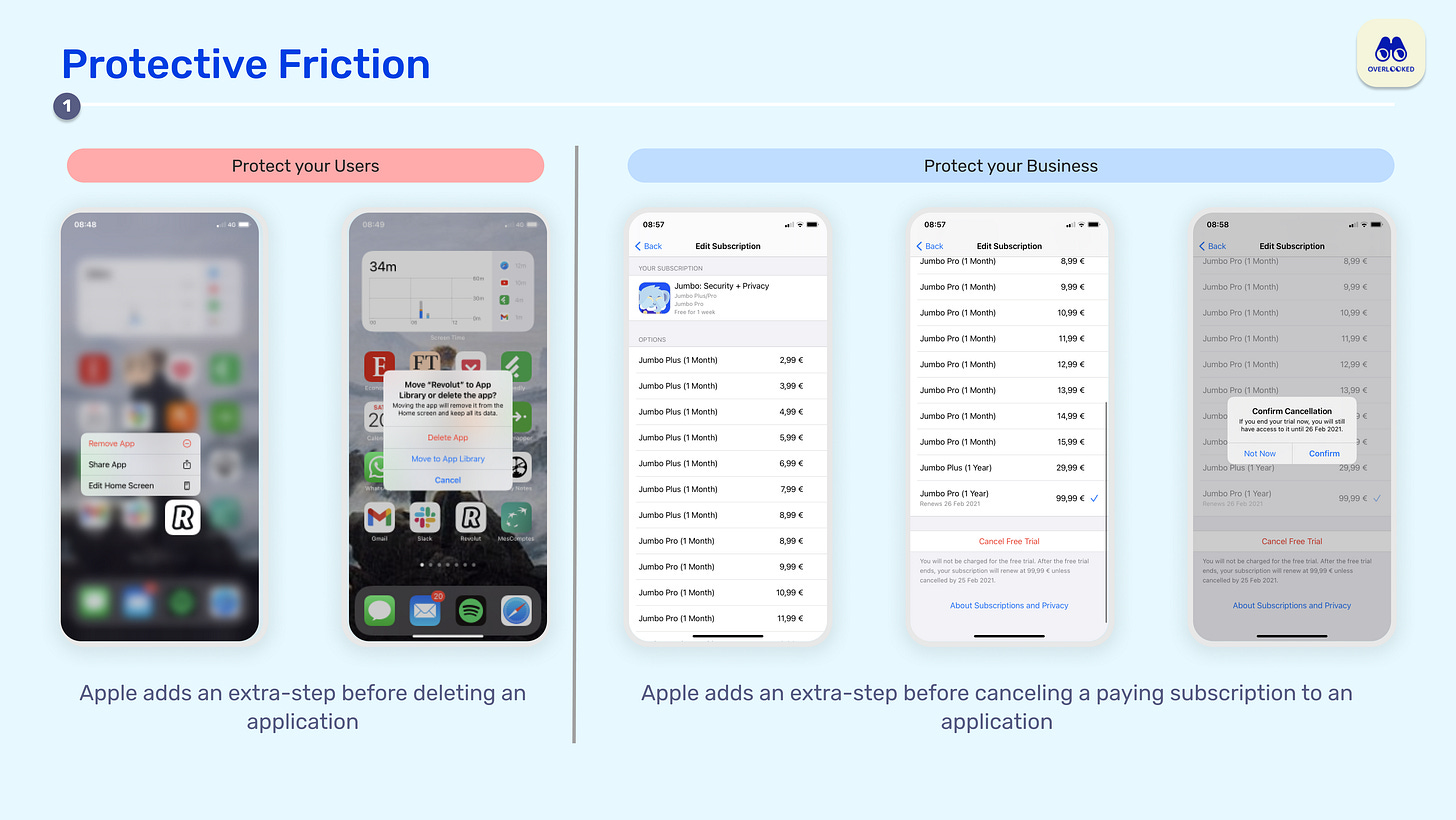
Mistakes happen. Mistakes can be detrimental to your users and also to your business. Sometimes adding an extra step in the user journey is crucial to force the user to reflect before he chooses to do something that could be detrimental to him or to you.
When you delete a folder on your Mac or an application on your iPhone, you will have a confirmation pop-up to make sure that you really want to delete something. Just in case that you are doing it inadvertently.
When you cancel your subscription, it can be detrimental for the company you are subscribed to. This is why, you will often have a confirmation step before being able to cancel your subscription. Typeform goes even one step further by forcing churning users to answer a form explaining why they are churning before deleting their subscription.
Use Case n°2 - Adding Artificial Waiting within your App to Build Credibility with your Users
Onboarding processes are sometimes too fast to look trustworthy to the average user. Some online security checks can be done instantly but if you reflect this instantaneity directly in your user experience, it may jeopardise your credibility. It could be useful to artificially add waiting time and additional screens to build credibility with your users.
Most financial apps have extra-long onboarding processes. On AppFuel, the longest onboarding flow is a European financial trading app called BuxZero which has 67 screens before one can access the core of the app. On the one hand, it seems normal as financial apps have to follow financial regulations and do heavy know your customer processes. On the other hand, I'm sure that those apps play with these obligations to build credibility with users. You need to trust a finance app before starting to use it and adding extra-friction in the onboarding process is a way to do so.
We also encounter artificial waiting in fitness and nutrition apps. Most of these apps are adding a fake loading page after the customization flow to make the users believe that they will access a unique and tailor-made plan just for them.
Use Case n°3 - Create the Illusion of Immediacy When you Have to do Some Work in the Background
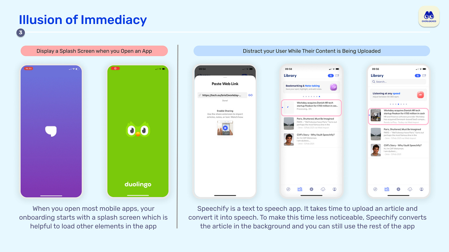
This use case is the opposite of the previous one. Sometimes, you have to distract your users with extra friction while you are loading a page for him or when the internet bandwidth is not sufficient to offer an instantaneous experience to the user.
Displaying a splash screen when you open an app. When you open most mobile apps, your onboarding (e.g. Jour and Duolingo) starts with a splash screen which is helpful to load other elements in the app.
Distracting your users while their content is being uploaded. For instance, Speechify is a text to speech app. It takes time to upload an article and convert it into speech. To make this time less noticeable, Speechify converts the article in the background and you can still use the rest of the app
Use Case n°4 - Value Added Friction
You should also understand friction as a way to add value to your product. Implementing artificial barriers to entry and obstacles in the customer journey can make your users more committed to your product.
Nowadays, most new mobile apps are developed in a private beta that you can only access after filling a long and detailed form. It's a way for app developers to filter their early users by making sure that they fit with their ideal persona and that they have the right workflows to use your product (e.g. if I'm building an Apple-only app in the early days, I don't want Android users).
When you pay for a service, you are also committed to use it more regularly. Many subscription apps are highlighting in their paywall that their paying users have more chance to be successful using their service than non paying users. Did you know that paying users are 38% happier on Reflectly and 4.2x more likely to complete a course on Duolingo? The friction of a payment is a way to have your users committed for the longer term.
Both gaming and education apps are based on this concept of friction. You need friction to feel that you are getting better at learning a new language or playing a new game.
Conclusion
I’m convinced that all the best consumer products have counter-intuitive UX choices - or at least choices which were considered as counter-intuitive at the time they were first implemented. You cannot imagine how your users will behave. You cannot infer from benchmarks what is good UX for your app. You have to implement a culture of experimentation and try as many combinations as possible to find the UX choices that make sense for your product. Sometimes, those choices will imply to add friction in your product.
Moreover, most digital products are pushing user to from one step to another without given them time to think. This is not always good. Sometimes, we need moments to think about what we are doing. To instaure an healthy relationship with your users, you need to have the right amount of friction points to make them think when needed and to provide them with a smooth experience otherwise.
Thanks to Julia for the feedback! 🦒 Thanks for reading! See you next week for another issue! 👋


